dual coding – Education & Teacher Conferences Skip to main content
Piece-by-Piece PowerPoint: Exploring the “Dynamic Drawing Principle”
Andrew Watson
Andrew Watson

The plan for this blog post:

First: I’ll describe a particular teaching practice — one that I’ve used in my own work for quite a while.

Then: I’ll describe the reseach behind the practice — which I discovered just recently.

Finally: I’ll zoom back to offer a larger perspective.

The Potential Paradox of Dual Coding

Long-time readers know that I’m a fan of “dual coding.”

As Oliver Caviglioli has explained in his marvelous book, students learn more easily if our explanations include both visual and verbal representation.

A pencil drawing of two hands clasping each other

That is: teachers should combine a description in words with a “stable visual representation” — a diagram or outline or graph. (Cavilgioli offers dozens — probably hundreds — of examples.)

This technique, although mightily helpful, requires lots of thought to pull off effectively. One problem in particular has raised challenges in my own consulting work.

On the one hand, I want to clarify the various cognitive science concepts I’m describing — say, tripartite attention, or schema theory, or even dual coding itself — by creating “stable visual representations” of them.

On the other hand, those concepts include LOTS of important pieces. A rich understanding of them requires grokking those pieces and the relationships among them.

For this reason, my “stable visual representation” — which exists to reduce working memory load — might in fact overwhelm working memory. SO MANY pieces. SO MANY important relationships.

What’s a consultant to do?

It Just Might Work…

Over the years, I’ve developed a technique that a) makes sense to me, and b) just seems to work.

I start by creating the final version of the “stable visual representation” I want teachers to understand.

For instance, I regularly show Dr. Efrat Furst’s “pyramid model” to explain schema theory:

Furst Pyramid Model

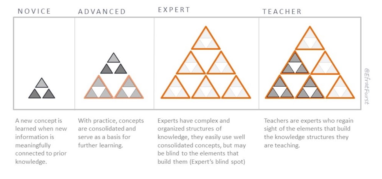
To explore this model in depth, you can check out Dr. Furst’s EXCELLENT website here.

As you can see, this model includes an ENORMOUS number of concepts (and relationships among them).

For that reason, I don’t start with the model itself; instead, I break it down into incremental pieces and add to them one at a time. (This is the teaching technique I promised at the top.)

So, my first slide simply has the four large grey rectangles: the barest visual outline of the diagram.

Only then — one at a time — do I add in “novice” and then “advanced” and then “expert.” (I don’t even mention “teacher” at this point — because the core distinction between “expert” and “teacher” won’t make any sense until the first three stages do.)

With the rectangles and the labels in place, then I’ll start talking about the three “novice” triangles on the left — in fact, only the two dark gray ones on the lower row. Teachers have to understand the concepts they represent before adding the third top triangle will be helpful.

And so forth.

In other words: presenting this diagram takes probably 10 PowerPoint slides and several dozen (more than 100?) animations.

In this way — I hope — I can successfully dual code the concept of schema theory.

I’m saying the words, and gradually … very gradually … unveiling piece by piece by piece the stable visual representation.

Of course, I’m not the only person to work this way. For instance: in Adam Boxer’s top-notch book Teaching Secondary Science, Boxer describes his method for explaning the anatomy and function of the heart with just such a step-by-step unveiling. If you haven’t read this book yet, you REALLY should.

But Wait, We’ve Got Research…

Usually in this field I find research that gives me new teaching ideas.

Occasionally I find reseach that supports teaching practices I’m already doing.

In this case: I’ve long hoped that reseach supports my step-by-step dual coding practice. But, to be honest, I never knew of any such research.

Recently, a friend mentioned something called the “dynamic drawing principle” — and sure enough, I struck research gold (or something close to it).

The first set of studies on this topic was done by research greats Logan Fiorella and Richard Mayer.

Over a series of four studies Fiorella and Mayer reached several tentative conclusions:

Students learn more when they see a professor draw diagrams representing the concepts under discussion — rather than seeing the professor talk about an already-drawn diagram.

This effect held when students saw the professor’s fully body while they drew, or simply the hand as it drew.

In some cases, the students’ prior knowledge mattered to these results; in others, it didn’t.

In another more recent study, Selen Turkay found that students learned more from animated drawing than from a video of a lecture, an audio recording of a lecture, and the finished drawings without the animation.

Although we don’t have lots-n-lots of research here, we have initial support for the teaching practice described above. That is: students seem to learn more when the dual coding diagram is created bit by bit in front of them, rather than revealed all at once.

That is, in a phrase, the “dynamic drawing principle.”

Not So Fast

If you’ve been reading closely, you’ve spotted a flaw in my claim that the dynamic drawing prinicple supports my piece-by-piece-PowerPoint method.

The flaw? Drawing.

My technique unveils and moves objects on the slides, but I don’t actually draw these diagrams live in front of the audience.

If you look at the complexity of Furst’s diagram, you can see it would be nearly impossible to do so. (And, I’m a terrible drawer. Friends even make fun of my handwriting…)

In fact, Fiorella and Mayer tested this very question. In their third experiment, some students watched a lecture with completed drawings, and others saw the drawings appear without a hand drawing them. (Fiorella and Mayer used an iPad drawing capture technology.)

Sure enough, students did NOT learn more from these handless live drawings than from completed drawings.

So, what will I do?

The Perfect Is the Enemy of the Good

As I see it, we have a small number of research studies which suggest…

… my piece-by-piece-PowerPoint idea is a good idea, but

… it might not help without live drawing.

That tentative research-based advice faces off against compelling experiences:

First: I simply could not possibly create these diagrams live. Not gonna happen. No ma’am.

Second: I regularly get compliments on my piece-by-piece method.

No, really. When I show my step-by-step visual explaining the functioning of working memory, for instance, teachers occasionally interrupt me to say “that was SO helpful.” (I am not making this up.)

And while I understand why live drawing might be better than PowerPoint revealing, I think my “dynamic-kind-of-drawing” technique is probably better than a Big Reveal of a complete, complex diagram.

For all these reasons, I’m going to keep going with my current practice.

And — I promise! — I’ll keep my eye out for further research that might persuade me to change my ways.


Fiorella, L., & Mayer, R. E. (2016). Effects of observing the instructor draw diagrams on learning from multimedia messages. Journal of Educational Psychology108(4), 528.

Turkay, S. (2022). Comparison of dynamic visuals to other presentation formats when learning social science topics in an online setting. Australasian Journal of Educational Technology38(5), 12-26.

Classroom Cognition Explained, or, Dual Coding Just Right
Andrew Watson
Andrew Watson

The Good News: research into cognitive science can be SPECTACULARLY USEFUL to teachers. (That’s why we have Learning and the Brain conferences….)

Book Cover for Teaching & Learning Illuminated

The Less Good News: ideas that come from cognitive science can be MISUNDERSTOOD and MISAPPLIED with alarming frequency.

For example: as I’ve written elsewheredual coding has lots of potential benefits for reducing working memory load — and thereby helping students learn. That’s the good news.

But — less good news — dual coding has too often been interpreted to mean “put icons on things to make them better.”

Wouldn’t it be great if someone could bring together LOTS of ideas from cognitive science, AND explain them with well-executed dual coding?

Yes; Yes It Would…

Well, someone has done exactly that. Three someones, in fact.  Bradley Busch, Edward Watson (no relation), and Ludmila Bogatchek have written Teaching and Learning Illuminated: the Big Ideas, Illustrated.

As that title promises, this book illuminates (that is, dual codes) the greatest hits from cognitive science: retrieval practice, cognitive load theory, Rosenshine’s principles, mindset, and a few dozen more.

Each section combines a pithy description of a particular concept with a visual representation of its core ideas.

So, for instance, page 35 summarizes dozens of studies looking at the benefits of spreading practice out (“spacing”) and practicing related topics together (“interleaving”).

And, the facing page offers a carefully considered graph that depicts learning over time. One path (“cramming”) looks good because it works so well in the short term. But the second path (“spacing and interleaving”) results in more learning over time.

Voila: “desirable difficulties” in one thoughtful graph.

Unlike so many examples of dual coding of the “put-an-icon-somewhere” school, Busch, Watson, and Bogatchek create substantial, meaty visuals that both require and reward careful study.

I never looked at the illustrations and thought: “gosh, that’s pretty.”

Instead, I thought:

Oh, gosh, I need to stop and study this for a bit.

Wait, why is that line there?

Ok, now I get it. Presumably this axis is labeled…oh, right, so cool!

In other words, the visuals both require thought and support thought. The result: readers understand these complex ideas even better.

So Many Shelves

I’ve written in the past that the “best book to read” depends on the reader’s current knowledge.

If you’re somewhat of a beginner in this field. I think you should probably read a book that focuses on just one topic: long-term memeory, or attention, or cognitive load theory.

Once you understand lots of the pieces, it’s time to read the books that put them all together.

Teaching and Learning Illuminated looks like an easy read — so many cool pictures! At the same time, it includes an ENORMOUS number of research-based insights and suggestions.

For that reason, I think of it as an “early-advanced” book more than one for those who are new to the field. Those illustrations are welcoming, but they also create cognitive demands of their own.

Full Disclosure

Because this field is relatively small, I know one of the three authors — Bradley Busch — a bit. (I recently recorded some brief video snippets for his website.)

I don’t believe our conversations have influenced this review, but the reader should know of them in making that evaluation.

I’ll also note: yes, I have written a book about Mindset; and yes, this book includes a mindset chapter called “The Watson Matrix.” But: their matrix isn’t about my summation of mindset theory.


Do Animations Improve Learning? A Definitivie Answer, Please…
Andrew Watson
Andrew Watson

Recently I discussed working memory overload with a group of wise and thoughtful teachers.

I showed them one of my favorite GIFs:

a glass (representing working memory),

slowly filling up with stuff (teaching methods, complex information),

so that there is ultimately no room left in the glass (that is: no room left for understanding).

VOILA: working memory overload in one handy animation.

I love this GIF, and show it often.

Young woman draws an animated storyboard

Yet when I gave these teachers time to discuss this animation, they honestly didn’t like it very much. They had lots of specific (and insightful) suggestions, but the overall message was: thumbs down.

So: should I ditch the GIF?

Where to Start

For a guy who writes a blog about research-informed teaching, the next step seem obvious: find out what the research says!

Surely I can find an answer — maybe even a definitive one.

Alas, I quickly stumbled into a quandry.

On the one hand, we’ve got lots of good research suggesting that — on the whole — students do NOT learn more from animated information.

One of the best known studies — led by the much-esteemed Richard Meyer — supports the static media hypothesis: “static illustrations with printed text reduce extraneous processing and promote germane processing as compared with narrated animations.”

In this study, researchers used animations about everything from lightning formation to toilet tanks to see if they helped students understand.

These animations never helped, and often hurt, student learning.

One the other hand, a substantial meta-analysis of 40 studies finds a “beneficial effect of the presence of animated display for learning dynamic phenomena.”

So: what to do when we’ve got persuasive — and contradictory — evidence?

A Feature, Not a Bug

For people unfamiliar with research-world, this kind of contradiction might seem like a failure. If the people who do the research can’t agree on an answer, surely we should just ignore them.

I would offer a different interpretation.

Teaching is complicated. Learning is complicated. PEOPLE are complicated.

So, any time we do research about people teaching and learning, we’re looking at enormously complicated questions.

Some disagreement is inevitable.

And — here’s the surprise — the fact that we found contradictions means that we’ve been looking hard enough. (If I didn’t find contradictory research, I probably haven’t looked very hard…)

What, then, should we do to resolve the (inevitable, helpful) contradictions?

One useful step: get granular.

In this case: presumably some kinds of animations are helpful under some kinds of circumstances. But others: not so much.

We need to know more about the specifics.

Okay, Some Specifics

With that in mind, I found a more recent study trying to understand when and why animations might hinder understanding.

The study, in effect, looked at two questions:

Are the animations essential to understanding the topic, or are they basically “decorative”?

and

Is the material being studied cognitively challenging?

Two scholars — Annabel Pink and Philip Newton — had students study slides with information on them. Some slides had animations; others didn’t.

And — useful to know — the slides covered complex material: human physiology and enzyme kinetics.

Sure enough, students remembered LESS information from the slides with animations. And they rated those slides as cognitively MORE challenging.

In other words:

When deciding whether or not to break out the GIFs, we can ask ourselves:

Am I just decorating the slide, or does animation help clarify the meaning of the material?

and

Is this material a cognitive heavy lift?

When I ask these questions about my working memory overload GIF, I arrive at these answers:

The GIF illustrates a complex process: it’s not decorative, but meaningfully connected to an understanding of the ideas.

BUT

The ideas are — in fact — quite complicated.

The animation, in other words, might add cognitive load to an already mentally challenging concept. Hence the teachers’ unhappiness.

Small, Medium, and Big Pictures

What should we teachers do with this information?

Narrowly stated, we can consistently ask the two questions above: a) is the animation “decorative”? and b) is the material cognitively challenging?

If either answer is “yes,” then we should hesitate to add animations.

More broadly, we should continue to look for detailed guidance about when to use, and when to avoid using, animations to help students learn.

As far as I can tell, we just don’t have a clear picture about the boundary conditions within which they help students learn.

The big picture looks like this.

Psychology research rarely gives us an absolute, definitive answer to questions like: “should we add animations or not?”

Teachers always need to look at research specifics, compare them to the classroom conditions where we work, and use our own expert judgment to analyze the goodness of fit.


Mayer, R. E., Hegarty, M., Mayer, S., & Campbell, J. (2005). When static media promote active learning: annotated illustrations versus narrated animations in multimedia instruction.. Journal of Experimental Psychology: Applied, 11(4), 256-265. https://doi.org/10.1037/1076-898x.11.4.256

Berney, S., & Bétrancourt, M. (2016). Does animation enhance learning? A meta-analysis. Computers & Education101, 150-167.

Pink, A., & Newton, P. M. (2020). Decorative animations impair recall and are a source of extraneous cognitive load. Advances in Physiology Education.

Should Teachers Explain or Demonstrate?
Andrew Watson
Andrew Watson

If I were a chess teacher, I would want my newbies to understand …

… how a bishop moves,

… how castling works,

… what checkmate means.

To help them understand, I could…

show them (“see how this piece moves; now see how that piece moves”)

tell them (“checkmate is defined as…”).

Both strategies sound plausible. Both probably help, at least a little bit.

Is one better than the other?

Today’s Research

I recently came across a fascinating study that explores this question.

A chess board seen from an angle, with red arrows showing how pieces might move in different combinations

In this research, two strangers met over an online puzzle — sort of a maze with prizes at the end of various paths.

Sometimes, one stranger could EXPLAIN to the other the best strategy to get the most points. (“Get the pink triangles, then the hollow squares, then the green circles.”)

Other times, one stranger could SHOW the other the winning path. (“Watch me go this way, now this way, now this way.”)

Which method worked better, show or tell?

PLOT TWIST.

In this case, the answer depended on the complexity of the puzzle.

For simple puzzles, both methods worked equally well.

For complex puzzles, telling helped more than showing.

I would have been surprised if there were a straightforward answer to the question; I am, therefore, more inclined to believe this “it depends” answer.

Take Two

This result — explaining complexity > showing complexity — prompted the researchers to test a second hypothesis.

In this case, the research details get very tricky, so I won’t go into them. But the basic idea was:

Perhas both words and actions can explain concrete things, but

Perhas words do better than actions at explaining abstract things.

Sure enough, the second experiment supported that hypothesis.

As the researchers say in their first paragraph:

Our findings suggest that language communicates complex concepts by directly transmitting abstract rules. In contrast, demonstrations transmit examples, requiring the learner to infer the rules.

In brief, the more abstract and complex the concept, the more important the words.

Teaching Implications?

Before we rush to reform our teaching, we should notice several key points about this study:

It involved adults working with other adults, and strangers working with strangers.

The participants were not — as far as I know — teachers. That is: they have neither expertise nor training in helping others understand.

The task involved (sort of) solving mazes. I’m an English teacher; my teaching — and perhaps your teaching — doesn’t focus on maze-solving like mental activity.

In other words, because this research differs A LOT from typical classroom work, its findings might not apply precisely to classroom work.

Teaching Implications!!

That said, this study reminds me of an important lesson:

Practice. My. Words.

That is: when I’m explaining a concept to my students for the first time, I should script and rehearse my explanation carefully.

Now, because I’ve been teaching for a few centuries, I’m occasionally tempted to wing.

Yes, “indirect object” is a tricky concept … but I understand it well, and I’ve explained it frequently over the years, and I’m sure I’ll do just fine…

No, wait, stop it. This research reminds me: words really matter for helping students understand abstractions.

I need to get those words just right, and doing so will take time, thought, and concentraction. (Ollie Lovell emphasizes a similar idea when he writes about the importance of “bullet-proof definitions”; for instance, in this book.)

A second point jumps out at me as well.

This study contrasts showing and telling. Of course, most of the time we combine showing and telling.

As I’ve written before, Oliver Caviglioli’s Dual Coding offers a comprehensive, research-informed exploration of this complex blend.

When I think about dual coding, I typically focus on the “showing/drawing” half of the “dual.” This study, however, reminds me that the “telling” part is equally important — and, in the case of highly abstract concepts, might even be more important.


In brief, in my chess classroom:

I can simply show my students how bishops move: that’s easy.

But “checkmate” is complex. I should both show and tell — and get the telling just right.


Sumers, T. R., Ho, M. K., Hawkins, R. D., & Griffiths, T. L. (2023). Show or Tell? Exploring when (and why) teaching with language outperforms demonstration. Cognition232, 105326.

Teaching with Images: Worth the Effort?
Andrew Watson
Andrew Watson

According to Richard Mayer’s “multimedia principle,”

People learn better from words and pictures than from words alone.

If that’s true, then we should — obviously — be sure to include pictures in our teaching.

However…

Whenever we see a broad principle like that, we should always look for specific limitations.

That is…

… does this principle apply to kindergarteners as well as 5th graders and adult learners?

… does it apply for students with an ADHD diagnosis?

… is it true when teaching Civil War history, theorems about similar triangles, and bunting strategies?

And so forth.

Researchers call such limits “boundary conditions,” and we should ALWAYS look for boundary conditions.

So, let’s look at that broad principle ( “pictures + words” > “words”) and ask this boundary question:

Does the content of the picture matter?

Possibilities and Perils

Happily, one of the people asking that question is…Richard Mayer himself.

In his career, he’s come up with a whole suite of useful principles. And, he spends lots of time looking for boundary conditions.

Specifically, in a usefully straightforward study, he and Eunmo Sung study several different kinds of images:

Instructive images: “directly relevant to the instructional goal.”

I’m teaching Macbeth right now, and focusing on the play’s tension between order and chaos. So, I might show students a picture of Scotland’s craggy wildernesses (chaos) and one of a highly structured royal ceremony (order).

Seductive images: “highly interesting but not directly relevant to the instructional goal.”

A movie version of Macbeth — starring Denzel Washington and Frances McDormand — just came out. I could show my students a picture of these two movie stars on the Red Carpet at an Oscar ceremony.

Decorative images: “neutral but not directly relevant to the instructional goal.”

Macbeth can be a grim play: so much beheading, so much unseaming. So: I could include pictures of waterfalls and sunrises on my handouts to raise my students’ spirits a bit.

Once we start exploring these potential boundary conditions — perhaps not all images benefit learning equally — we might get even more useful guidance about combining words and images.

Predictions and Results

Sung and Mayer measured the effects of such images on students’ learning AND on their enjoyment of a lesson.

Take a moment to make some predictions on your own.

Which, if any, of those graphics will help students learn more?

Which, if any, will help students enjoy the lesson more?

[I’ll pause while you think about those questions.]


Perhaps you, like Sung and Mayer, predicted that ALL the images would increase students’ enjoyment.

And perhaps you predicted that the INSTRUCTIVE images would help students learn, but not the others.

Sure enough, you and they were right. Students LIKE images, but LEARN FROM images that focus their attention on the learning goal. (If you’re interested in the specific numbers, look at the 6th page of the study.)

We should, I think, focus on this key finding: students do not always learn more when they enjoy a lesson more.

We shouldn’t deliberately make our lessons dull.

But: we shouldn’t assume that an enjoyable lesson necessarily results in more learning. In this case, those photos of Macbeth movie stars piqued my students’ curiosity and interest, but didn’t help them learn anything about the play.

Three Final Points

First: the benefits of dual coding have gotten lots of attention in recent years.

To get those benefits, we should remember these boundary conditions. Dual coding helps if — and only if — the images highlight the learning goal.

Second: a recent meta-analysis about “seductive details” nicely complements this study.

Third: Like many teachers, I see the good and the vile in Twitter.

Yes (YES!!), it can be a sink of repulsive yuckiness.

And (surprise!!), it can also be supportive and helpful.

I bring up this point because: a wise soul on Twitter mentioned this Sung & Mayer study recently, and reminded me of its importance.

I can’t remember who brought it up (I would credit that tweep if I did), but I’m grateful for the nudge.

Such useful research! Such helpful guidance!


Sung, E., & Mayer, R. E. (2012). When graphics improve liking but not learning from online lessons. Computers in Human Behavior28(5), 1618-1625.

A New Book on Dual Coding (That Redefines the Word “Book”)
Andrew Watson
Andrew Watson

Oliver Caviglioli has written a book about dual coding. (Nope. That’s not it. Let me start again.)

Oliver Caviglioli has created a new genre.

It’s 50% scholarly essay, 40% graphic novel, 5% Ulysses, and 5% its own unique magic.

Let me explain.

Back in the 1960s, Allan Paivio developed a theory about cognitive processing. The short version is: humans can process information more effectively if we take in some of it through our eyes, and some through our ears.

Because it encourages us to use two different channels for processing, it’s called dual coding.

Writing a book about dual coding, however, invites paradox. Books, especially traditionally scholarly books, rely almost exclusively on words, and have only occasional images.

But such a “traditional scholarly book” would contradict the very theory that Caviglioli wants to explain. So, he had to come up with something new.

Indeed he has: Dual Coding with Teachers is like no book you’ve seen before.

The Parts

Caviglioli divides his “book” into seven “chapters” — although each is more a free-standing entity than the word “chapter” suggests. (For the sake of convenience, I’m just going to call them chapters.)

Chapter 1, called “Why?”, offers a substantial explication of Paivio’s theory. It goes into schema theory, different conceptualizations of working memory, and even embodied cognition. It reviews lots of persuasive evidence for many segments of the theory.

Following chapters take up different topics for using dual coding theory thoughtfully.

Chapter 2 (“What?”) sorts uses of the theory into specific categories: graphic organizers, walkthrus, sketchnotes, and so forth.

Chapter 3 (“How”) explains the process of creating a successful version of each category.

In every case, Caviglioli combines words with icons and images to map out the concepts and their relationships.

That is: he employs dual coding to explain the theory and practice of dual coding.

Said in other words: readers can learn as much about dual coding by studying the design and execution of the book as they can by studying the book’s contents.

The Sum of the Parts

I suspect few people will want to treat Caviglioli’s creation like a typical book. That is: you won’t read it from beginning to end.

Instead, you’ll probably use it more like one of those 800 page manuals that used to come with complex software. You’ll dip in and out; leaf around looking for pointers or for inspiration.

If you’re having trouble deciding which kind of visual to use, have a gander at chapter two.

If you’re dissatisfied with the look of your poster, check out chapter 4 (“Which”). It offers some essential design principles, and even pointers on how best to hold a pencil. (Not joking.)

If you’re looking for inspiration, savor Caviglioli’s longest chapter: “Who.” These 70+ pages (!) offer dozens of examples where teachers, psychologists, and others show how they use dual coding to teach, persuade, clarify, organize, simplify, and deepen.

As a final strategy, you might check out Caviglioli’s Twitter account: @olicav. Since the book came out, teachers have been trying out his approach and asking for online feedback. The result: a day-by-day tutorial in applying the principles of dual coding to a complex variety of classroom needs.

Closing Thoughts

Because Caviglioli has created a new genre, he makes extra demands on his readers. These pages–although beautiful–can be informationally dense. If you’re like me, you won’t so much read each page as dwell upon it for a while.

In fact, you’ll probably go back to re-dwell on earlier pages as you try to put the pieces together.

My suggestion: be patient with yourself. You might need more time to explore Dual Coding than you do with most books. You might also find that extra time well worth the revelation.

Obsessed with Working Memory: SOLUTIONS!
Andrew Watson
Andrew Watson

At the beginning of July, we started an in-depth series of posts about working memory.

For starters, we learned how to define it: “a short-term memory capacity that selects, holds, reorganizes, and combines relevant information.” (Handy acronym: SHREK.)

We then focused on its key features. It’s essential for classroom learning. It’s alarmingly small. And we can’t make it bigger (artificially).

For all those reasons, teachers need to be experts at anticipating WM overload. For example: look out for these Dark Sides of the Force.

And, we need recognize WM overload when it happens. (That student who forgot his question while his hand was in the air? That was probably a working memory problem.)

Today’s task: start SOLVING all those problems that we anticipated and recognized.

Solutions, Part I: Rely on Long-Term Memory

First: connect new information to information that students already have in their long-term memory.

Why does this strategy work? Because ideas and facts in LTM require much less working-memory processing than information coming in from the outside world.

And so: if a new idea resembles something in LTM, then that pre-existing knowledge acts as a kind of cognitive crutch.

For example, whenever I teach my students about gerunds, I teach them the Beyoncé rule:

If you like it then you should have put an -ing on it.

My students already have that catchy tune in their heads. By attaching a new grammatical rule (“all gerunds end with ‘-ing’ “) to that catchy tune, I reduce its WM demands.

As a bonus, I also make them laugh.

Second: explicitly teach core facts and processes.

“Rote memorization” of “random facts” has gotten a bad reputation. It seems so not-21st-century.

Alas, we can’t think without knowledge.* If our students have already learned the foundational ideas, definitions, dates, and processes before they start grappling with complex cognitive work, they’re much more likely to succeed.

Why? Because all that prior knowledge in long-term memory reduces WM load.

Solutions, Part II: Spread Cognitive Work Over Time

This solution is so helpfully straightforward.

If a lesson plan overwhelms WM because it includes too much information RIGHT NOW, then don’t include all of it right now. Spread it out.

In some cases, that simply means reorganizing the lesson plan. Let students practice the first topic they learned before they move on to the next one.

Once they’re comfortable with a particular mental process, they’re ready to take more ideas on board. (Barak Rosenshine, I’m looking at you.)

In other cases, you might reconsider if this information needs to be included immediately.

Are you students struggling with several instructions? Spread them out.

Here’s a handy strategy: give one instruction, and wait for all students to complete it before giving the next. (I got this advice at the very first Learning and the Brain conference I attended. Pure magic.)

Note, too, how exceptions can be postponed.

In French, “all nouns that end in -ette are feminine.” Knowing that rule reduces students’ WM load: they have fewer variables to juggle as they tinker with adjectives and pronouns.

That rule, however, has an exception: “squelette” is masculine. But — this is crucial — my students don’t need to know that right now. Why would they need the word “skeleton”?They’re not watching CSI Paris.

So, I can reduce WM load by leading with the rule and postponing exceptions until they’re necessary. (You can alert your students that exceptions might show up later, so they don’t lose faith in your expertise.)

If you anticipate or recognize WM overload, ask yourself if you can put off some of this cognitive work until later in the lesson plan…or, later in the syllabus.

Solutions, Part III: Make Cognitive Work Auditory AND Visual

Schools rely a great deal on auditory processing. That is: students listen to us — and to each other — talking.

However, working memory has both auditory and visual processing capacity. If we use only half of it, we’re leaving substantial cognitive resources untapped. It’s like asking students to carry a heavy box using only one arm. Two arms would be So Much Easier.

This approach leads to some very straightforward strategies. Verbal instructions take up lots of working memory capacity. Written instructions take up less — because students don’t have to “select” or “hold” them.

Oliver Caviglioli has just written a genre-defining book on combining visual and verbal information: Dual Coding with Teachers. If you want to focus on this teaching strategy to reduce WM load, you should get your copy ASAP.

Solutions, Part IV: CUT

Let’s take this hypothetical:

You look at your lesson plan, and anticipate a great deal of working-memory overload. So, you start using these strategies.

You find ways to connect new information to ideas students already know (solutions, part I).

You find ways to spread information out over time (part  II).

You move lots of WM labor into the visual realm (part III).

And yet, you still worry the working-memory load might be too high. What can you do?

You’ve really got only one choice: take stuff out of the lesson plan — and maybe the syllabus. You’ve got to cut.

That’s a troubling answer. We don’t want to cut, because we want our students to learn it all. (And, we might be required to cover lots of things.)

But, here’s the reality: if my lesson plan/syllabus overwhelms my students’ working memory, then their cognitive processes will shut down. That is: their brains will cut stuff out automatically.

If I know that’s going to happen, the only responsible course of action is to make those cutting decisions for them. After all, because I’m the teacher, I know better which parts can be cut without long-term harm.

The Good News about Part IV

By the way: there is some hidden good news in this strategy. If we cut material from an overstuffed syllabus today, then our students are much likelier to learn the remaining ideas than they were before.

As a result, they’ll be better positioned to learn the ideas that come later in the curriculum.

As is so often the case: less might be more. That is, less information early in the curriculum might lead to more learning by the end of the year. Why? Because “less” allowed students to use their working memory more effectively, and hence create more long-term memories.

Concluding Thoughts

I’ve named several strategies here, and given quick examples.

However, to get the most from these ideas, you will adapt them to your own circumstances. As you’ve heard me say before: “don’t just do this thing; instead, think this way.”

That is: once you’ve started THINKING about working memory in your classroom with your students and your curriculum, you’ll see your own way to apply each strategy most effectively.

No one else can tell us exactly how to do it. Using our teacherly insight, wisdom, and experience, we will shape those ideas to fit the world in which we teach.

In sum: once we anticipate and recognize working memory overload, we’ve got many (MANY!) strategies to reduce that load. And, those strategies are flexible enough to work in every classroom. The result: our students learn more.


* If you’re skeptical about the importance of prior factual knowledge, you’re not alone. But, the research here is compelling. Check out

Why Don’t Students Like School? by Daniel Willingham

Seven Myths of Education by Daisy Christodoulou

Making Kids Cleverer by David Didau