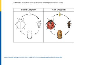
Here’s a practical question: should the diagrams we use with students be detailed, colorful, bright, and specific?
Or, should they be simple, black and white, somewhat abstract?
We might reasonably assume that DETAILS and COLORS attract students’ attention. If so, they could help students learn.
We might, instead, worry that DETAILS and COLORS focus students’ attention on surface features, not deep structures. If so, students might learn a specific idea, but not transfer their learning to a new context.
In other words: richly-decorated diagrams might offer short-term benefits (attention!), but result in long-term limitations (difficulties with transfer). If so, blandly-decorated diagrams might be the better pedagogical choice.
Today’s Research
Scholars in Wisconsin — led by David Menendez — have explored this question.
Specifically, they asked college students to watch a brief video about metamorphosis. (They explained that the video was meant for younger students, so that the cool college kids wouldn’t be insulted by the simplicity of the topic.)
For half the students, that video showed only the black-and-white diagram to the left; for the other half, the video showed the colors and dots.
Did the different diagrams shape the students’ learning? Did it shape their ability to transfer that learning?
Results, Please…
No, and yes. Well, mostly yes.
In other words: students who watched both videos learned about ladybug metamorphosis equally well.
But — and this is a BIG but — students who watched the video with the “rich” diagram did not transfer their learning to other species as well as students who saw the “bland” diagram.
In other words: the bright colors and specifics of the rich diagram seem to limit metamorphosis to this specific species right here. An abstract representation allowed for more successful transfer of these concepts to other species.
In sum: to encourage transfer, we should use “bland,” abstract diagrams.
By the way: Team Menendez tested this hypothesis with both in-person learners and online learners. They got (largely) the same result.
So: if you’re teaching face-to-face or remotely, this research can guide your thinking.
Some Caveats
First: as is often the case, this effect depended on the students’ prior knowledge. Students who knew a lot about metamorphosis weren’t as distracted by the “rich” details.
Second: like much psychology research, this study worked with college students. Will its core concepts work with younger students?
As it turns out, Team Menendez has others studies underway to answer that very question. Watch This Space!
Third: Like much psychology research, this study looked at STEM materials. Will it work in the humanities?
What, after all, is the detail-free version of a poem? How do you study a presidency without specifics and details?
When I asked Menendez that question, he referred me to a study about reader illustrations. I’ll be writing about this soon.
In Sum
Like seductive details, “rich” diagrams might seem like a good teaching idea to increase interest and attention.
Alas, that perceptual richness seems to help in the short term but interfere with transfer over time.
To promote transfer, teach with “bland” diagrams — and use a different strategy to grab the students’ interest.


